I could honestly write a whole thesis about this typeface, but I don’t have to – I more or less wrote a 6,000 word-long video about it which I highly recommend you watch.
Although I tell people that Thumbnail was my first ever font, that’s not quite true – the title actually belongs to Showa.
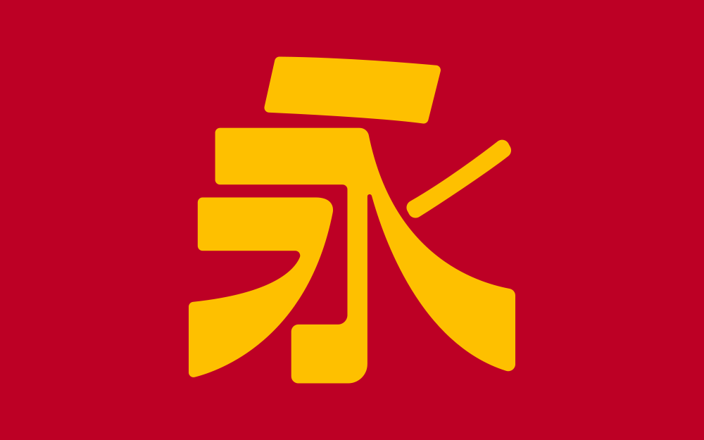
Development of Showa started around July of 2020. At the time I was on summer break from university and, unable to do much else given the situation at the time, decided to fill up my days by working on Fontendo, though while thinking about fonts in Nintendo games I came to wonder if there was an analogue for their logotype. While I found a few candidates for their English logo, I was drawn more strongly to their Japanese one. After a lot of research, I came across its closest lookalike – an undigitised phototypeface called FanRan E, by Sha-ken designer Nakamura Yukihiro.
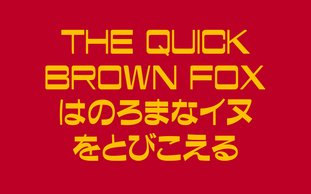
I quickly became obsessed. It was like no other typeface I had seen before. I knew that I had to have it! The Japanese portion of FanRan exudes elegance and refinement while the Latin portion gives off this wonderful retrofuturistic vibe. Truly, if there were not a man alive who loved FanRan then I would surely be dead.
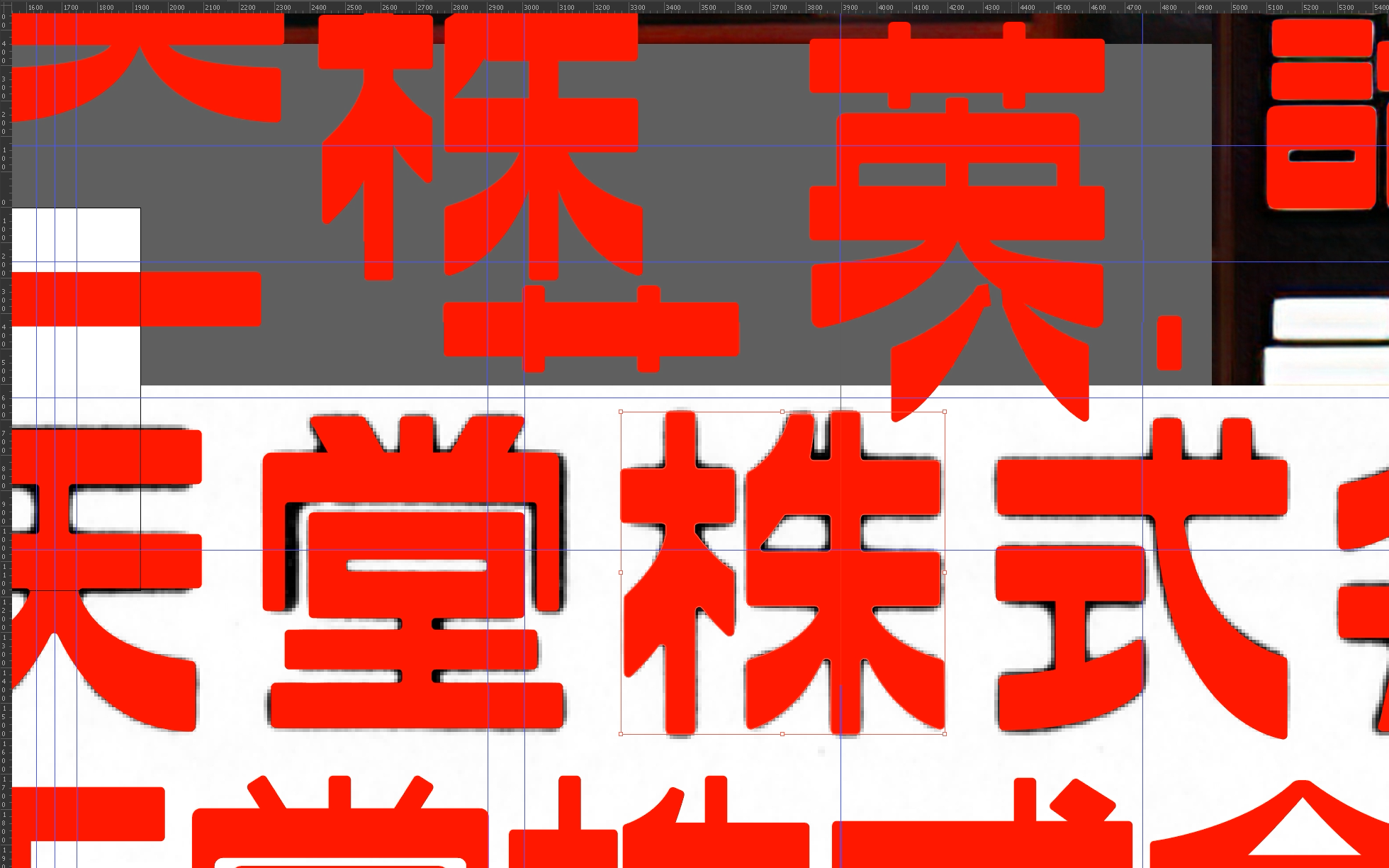
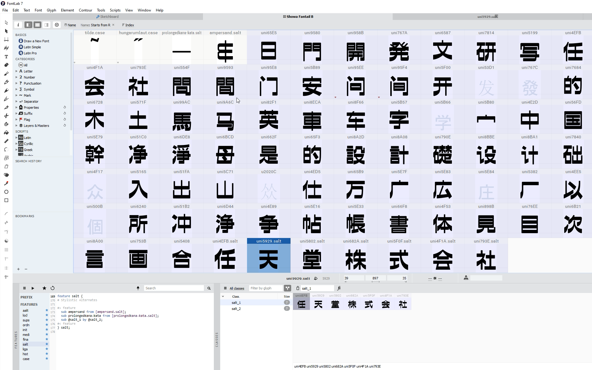
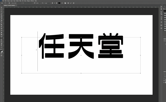
Without knowing much about type design at the time I began right away. I came across several high-resolution scans of the original phototype plates which I loaded into Illustrator and used to begin piecing together letters. It was rough, messy work. The file quickly bloated from the amount of parts. Working like a madman, I wanted to force the Fantail style to its limits and decided that it would support as many character sets as I could push myself to draw. English, Greek, Cyrillic, all types of Chinese, Japanese, Ainu and Ryukyuan languages. Every obscure form of Kana in Unicode. It contains comprehensive extensions which allow every language on the European continent to be rendered, and an easter egg in the form of OpenType alternates allowing you to render Nintendo’s Japanese logo!
I think it’s fair to say that FanRan, and my revival Showa, changed the course of my life. Without this project, I don’t think I would be in Japan right now with the job that I have. It taught me a lot about how fonts work, how to draw letters, and it sent me on a five-year-long journey to understand how Fantail came to exist in the first place. I am in perpetual admiration of Nakamura’s work, and can only dream that I live up to a fraction of what he accomplished. It was a privilege to try and revive FanRan. In all my type design work, my utmost desire is to capture the same passion that ignited when I began work on Showa.
Since publishing my video about Nintendo’s logo which mentioned FanRan and Showa, I have received countless comments, messages and even emails about releasing Showa to the public. Unfortunately, that is something I cannot do. As I have mentioned before in several places, being hired to work as a professional type designer means conforming to how big companies operate – and this means I cannot release fonts in my spare time – either for free or for money. Though perhaps the larger barrier to release is that my obsession with FanRan and creating a worthy revival meant that I massively over-scoped the project, and it remains unfinished to this day. About 99% of the Japanese Kana have been completed, along with all the necessary Latin, Greek and Cyrillic (and their mostly unneccessary extensions), but they lack thorough kerning and metrics. The Kanji/Hanzi are all over the place and are far from finished. The vector outlines of all the glyphs need to be cleaned up – and probably re-done from scratch in many cases. Even if I was permitted to release new fonts, my personal pride would prevent me from doing so, considering the current state of Showa.
FanRan E lives on in Morisawa’s digitisation, which is much more polished and professional than my own. That being said, FanRan and Showa will both forever hold a special place in my heart and type design journey.