Thumbnail was the first ever font project that I completed, which I did in my spare time while I was in the third year of my undergraduate degree. After working on the Fontendo Project for a considerable length of time, I figured that since I talked about fonts a lot, I should actually try my hand at making one and see where it went – and this was the result. I decided that the most practical project to begin with would be to make a font that I would get a lot of use out of – that being one I could stick in the thumbnails of my YouTube videos.
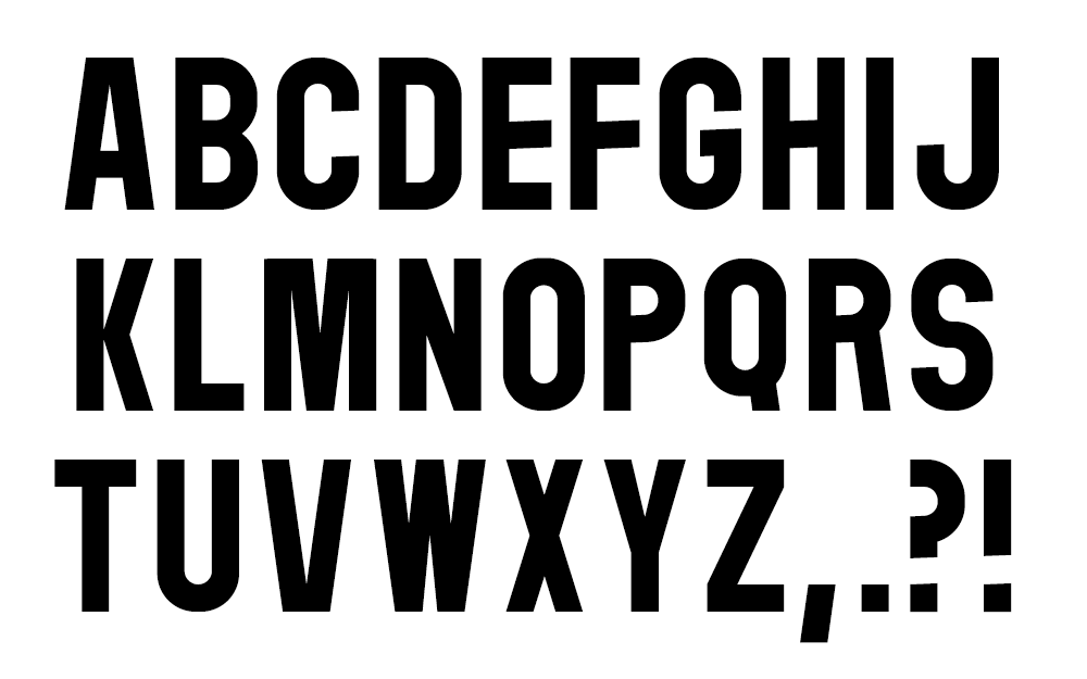
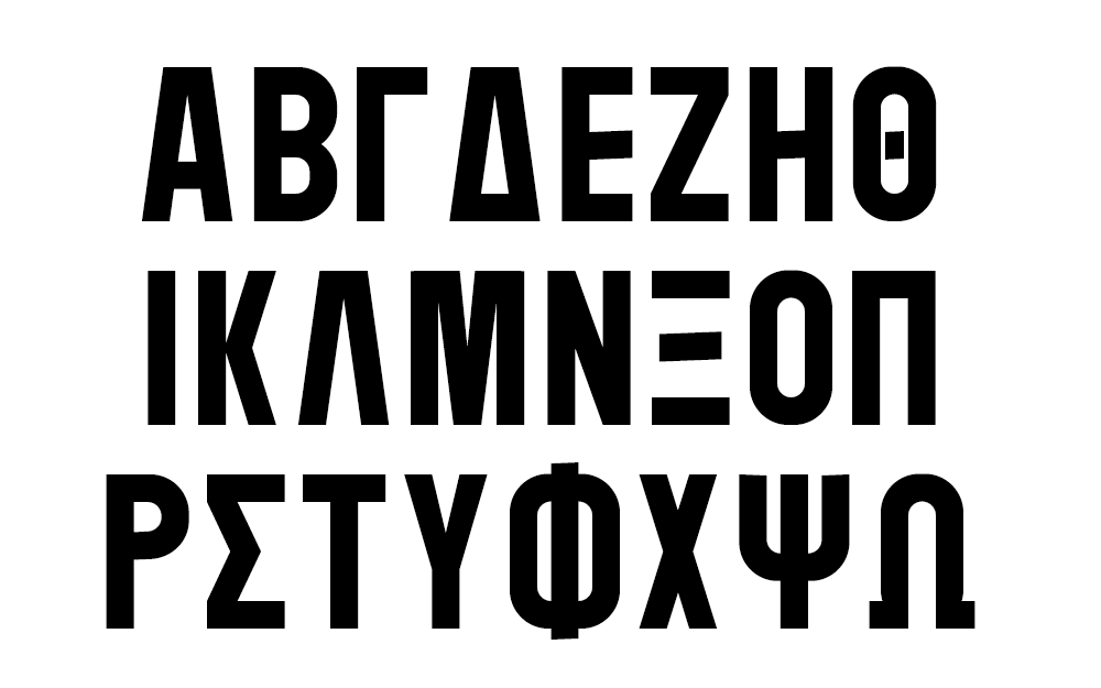
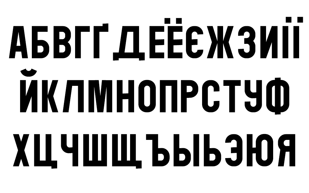
I focused on the upper case as that’s what’s used in most thumbnails and it gave me less initial work. While I adore Futura (to the point where I used it on my custom keyboard), I’ve always hated the C and S in its bolder and compressed forms. If I had to pinpoint a proper motivation for Thumbnail, it was to take Futura and Univers and try to smash them together into something I liked. Each letterform was created in Adobe Illustrator with a set of simple shapes before being copied over to FontLab 7 where each was positioned, adjusted, then spaced and kerned. Most of the horizontals are at a slight tilt – intended as a show of subtle dynamism while not detracting from the legibility of the typeface. After hammering out the Latin capitals I decided to include Greek and Extended Cyrillic because of how many shapes can be easily transplanted over. All glyphs were also horizontally compressed so that more could fit in the limited space that a thumbnail offers.
Looking back on the project now, there is a lot that I would do differently. My creative and learning processes can be best described as a sort of “guided chaos”. Similar to how I would never read video game instruction manuals as a kid, I prefer to dive straight into software and feel my way around. This resulted in some shall we say… interesting quirks. The kerning and metrics look mostly okay up front, but are a bit of a tangled mess behind the scenes. On top of that, my well-intentioned insistence on precise mathematical measurements for each component meant that some glyphs look thicker or smaller than others because I didn’t really consider tricks of the eye and optical alignment as important design factors. My “subtle dynamic tilt” also didn’t really do much in the end, though it did shine through on a few specific glyphs.
Thumbnail would benefit from being fixed up, but under terms of my current job I cannot release an updated version to the public. That being said, it’s still a decent font that I occasionally see out in the wilds of YouTube (special thanks to my friend Derek who is hands-down the most prolific user of Thumbnail). And most importantly – it was a lot of fun to make and set the stage for everything that came after!
Though it is not up to date, you can download Thumbnail here.
This font is released under the SIL Open Font License – and as such can be used, modified, and distributed freely (so long as the resulting font remains under the Open Font License). The only stipulations are that the resulting font bears a different name, and must remain free to use.