I started working on this typeface in September of 2025, but I don’t have a real title for it yet as it’s still an ongoing, evolving project.
As you can probably tell by now, I like to play around with styles from one country or writing system and apply them to another. My previous project Showa was fun to me because the Fantail style it drew upon was originally an American style that crossed the Pacific and became something new in Japan. My university dissertation focused on applying Japanese Universal Design principles to Arabic. After seeing a post on Twitter about a Chinese font based on Tibetan writing, I saw a follow-up which showed something reminiscent of blackletter but also for Hanzi. Fascinated, I wondered to myself if such a thing existed for Japanese – as a result I came across an old blackletter design called Black (Burakku) produced by TypeLabo for their own Letraset-style product, as well as a third-party one called Quickletter. Unfortunately it’s seen no other release since 1986 aside from a partial digitisation used in a handful of promotional materials on the TypeLabo website.
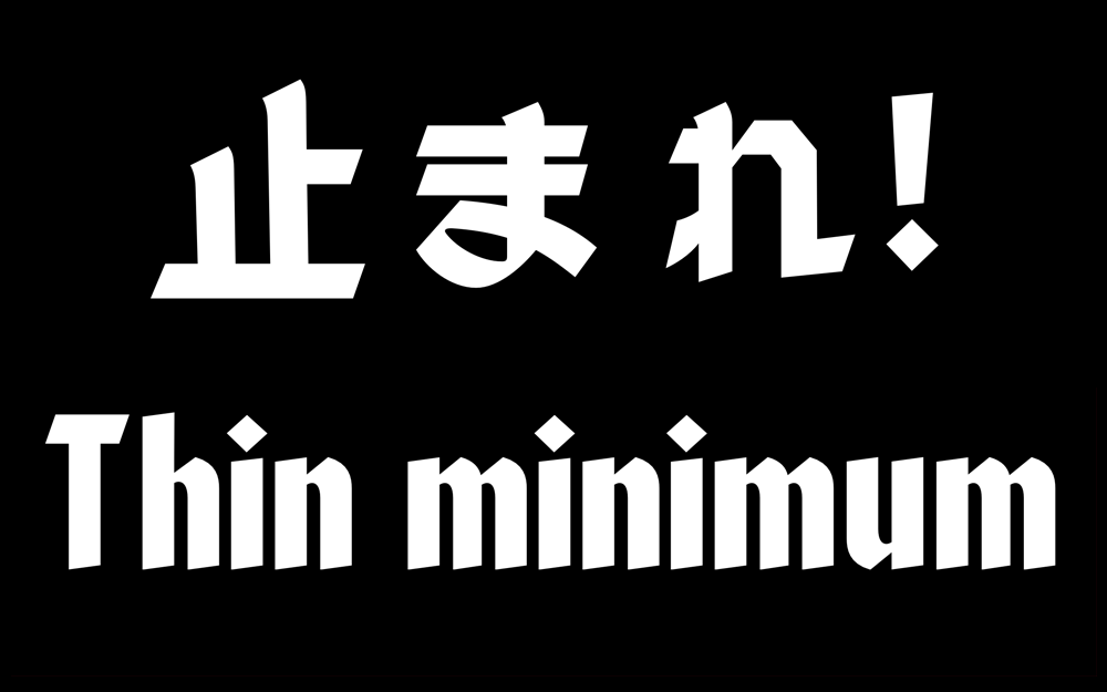
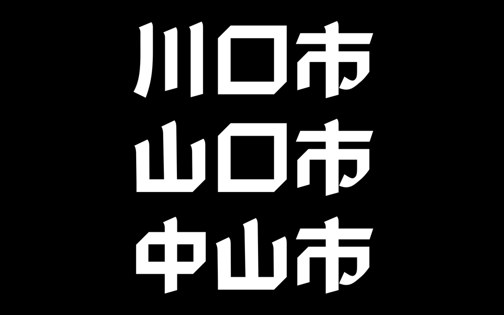
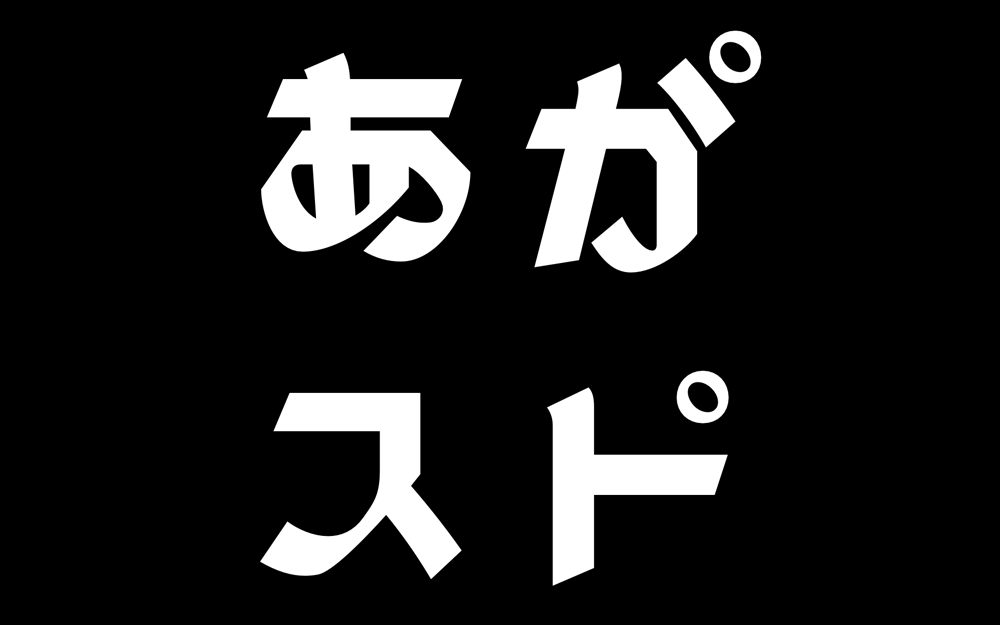
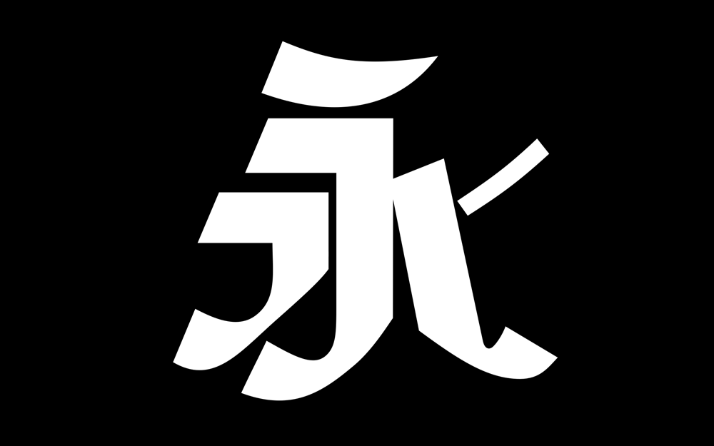
This typeface is really a combination of three different elements. The hiragana, katakana and some other miscellaneous glyphs are based on the aforementioned Black, while the Latin glyphs are a revival of an old blackletter face called Valiant – though I’m not a hundred percent set on the Latin portion and might change this. The kanji are all original – designed by me to be in the exact same style as Black’s kana. I have mainly focused on kanji because they’re more fun to create – referencing and tracing can get a bit dull after a while and I liken kanji to intricate puzzle pieces that need to be put together properly. I love solving a good puzzle. On top of that, I think that the squarer shape and puzzle piece nature of kanji makes them easier to contstuct – compared to kana which require more focus on the flow of the hypothetical pen. That being said, I have enjoyed extending the kana set so that it supports Japan’s often typographically neglected languages such as Dunan (the Ryukyuan language of Yonaguni Island) and Ainu.
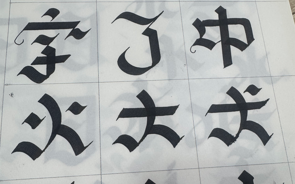
This was a project that required quite a bit of planning on paper. I could see that during the development of Black, TypeLabo had spent a lot of ink trying out letterform designs on graph paper but following some further testing eventually gave up on the idea of kanji. I sometimes do calligraphy in my spare time, though my approaches to Japanese and Western calligraphy are unsurprisngly different. It’s a fun and conscious effort to throw out my assumptions when trying to draw kanji with a thick-nibbed Pilot pen. It involves a new set of contraints which I have to figure out how to work around – what angle feels best? Which types of strokes are natural with this tool, and what can I get away with in kanji? A lot more than you might think, as it turns out. It feels like breaking the rules and reassembling everything in my own way. These letters and their rules… I will break them! I will twist them into pretzels and tie them into balloon animals!
My sometimes flippant attitude regarding type design might not be as understandable to my Japanese colleagues compared to Western designers. I once told a colleague of mine that I thought all new attempts to create gothic and mincho typefaces were “just designers trying to reinvent the wheel for the umpteenth time”, but I think the metaphor got lost in translation. One of my favourite Western type designers is Roger Excoffon, who produced many well-known and unique designs in his time. He even – in his own words – committed espionage by producing a typeface from an image in a newspaper of a rival’s work in progress – the resulting product was Banco. Whenever I see Banco in use, I always picture that one photograph of Excoffon with his tongue sticking out. I think there’s probably a bit of that Banco DNA in this blackletter project.